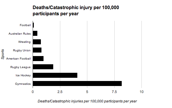
This graph shows the catasrophic/ fatal injuries per 100,000 participants in several different sports both contact and non-contact. The fact that really stands out on this graph is that gymnastics, a non-contact sport, is three to four times more dangerous in terms of spinal cord injuries and fatalities than Rugby Union, Rugby League and American Football.
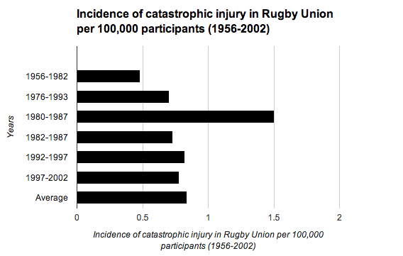
This graph shows how many catastrophic/ fatal injuries there were per 100,000 Rugby Union players at all levels of the game in England from 1956 to 2002 based on a number of different overlapping studies by different research teams. It shows that the incidence of catastrophic injury does not appear to be changing over time even though in this time Rugby Union has become a professional sport.
This graph shows how many catastrophic / fatal injuries there were in Australian Rugby League from 1984 to 2002. It shows just how few catasrophic/ fatal injuries there were for every 100,000 players at all levels.There is a limited amount of studies but from the data available it can be concluded that there is no strong trend upwards or downwards.
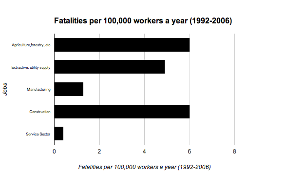
This graph shows how many fatalities as a direct result of work there were per 100,000 workers in jobs in the United Kingdom. What is most interesting about this graph is that in all the different work places the death rate is higher or the same as Rugby Union, Rugby League and American Football except in the service sector. I think this graph best shows that all three sports are still relatively safe and that parents run a bigger risk of having a life changing injury working than their children do playing the different sports.